We’re always looking for ways to make the app even easier and more accessible. That’s why we’ve redesigned the menu to show only what you really need.
A refreshed menu (☰)
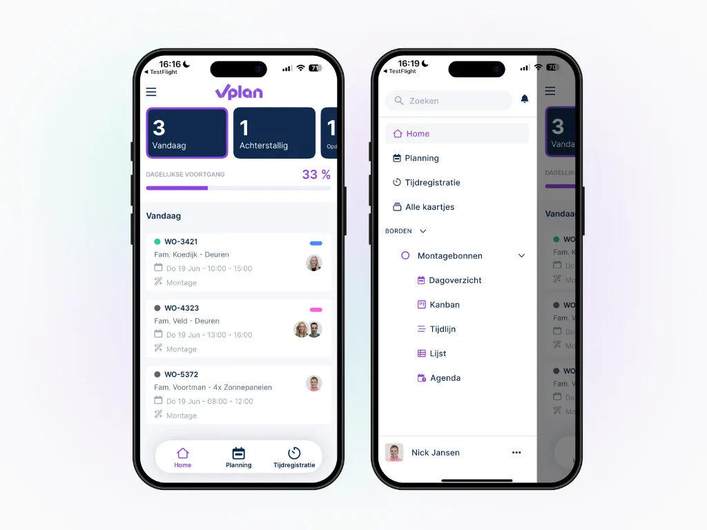
Navigation is now simpler than ever. At the bottom of your screen, you’ll find quick access to the most important sections: Home, Planning, and Time tracking. Everything you need to get your work done is right at your fingertips.
All other information is now grouped in one central location: the new menu. Here, you can easily switch between main items and boards, view your personal views, search through cards, and check your notifications.
At the bottom of this menu, you’ll also find your profile, user settings, and options to switch accounts or log out. That means: less searching, fewer clicks, and a clearer overview. You can get started right away, distraction-free.
View and create personalised views in the app 📲
What you already know from the desktop version is now available on mobile: personal views. You can not only view them, but also create your own — so you see your work exactly how you want, using the filters that matter to you.
Shared views help avoid misunderstandings and bring clarity by allowing everyone to look at the same setup. For example, use shared views as a standard during team meetings — everyone is on the same page instantly.
This update is more than just a visual upgrade. It’s a next step towards a powerful, intuitive app experience, wherever you work. Whether you’re a planner at the office or a technician in the field, the app now fits your daily workflow even better.
Try it in your own vPlan
Every new feature is in the free trial.