RED
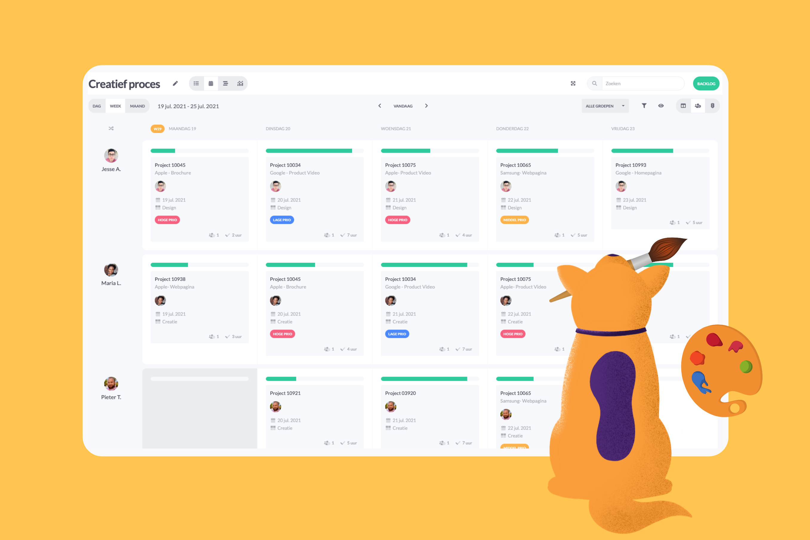
Red symbolizes danger, intensity, warning, and error, among other things. Red is one of the most attention-grabbing colors. By making an urgent label red, you are less likely to overlook it in your planning. Red is often associated with negativity. Something marked red in the planning should actually indicate a problem or issue.
Rood staat onder andere voor gevaar, intens, waarschuwing en fout. Rood is een van de meest opvallende kleuren. Door een label spoed rood te maken zie je deze minder snel over het hoofd in je planning. Rood wordt vaak geassocieerd met negatief. Iets wat rood is in de planning moet dus eigenlijk een probleem of knelpunten aantonen.
BLUE
Blue symbolizes calmness, reliability, and safety, among other things. If you use the (quality) control status in your planning, make this status blue.

ORANGE
Orange symbolizes action, enthusiasm, and enterprise. Use orange for statuses or labels where something needs to happen or has already started.

GREEN
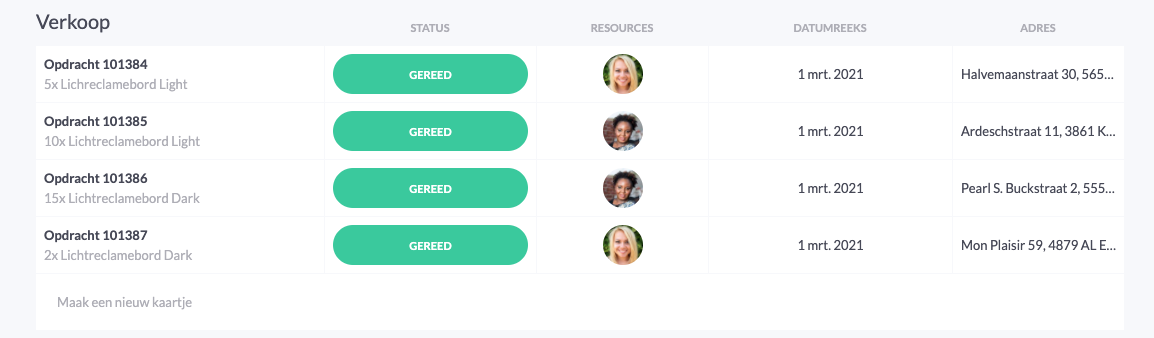
Green symbolizes relaxation and tranquility, but also confirmation and positivity. Make the completed or ready status green. This gives you an extra relaxed feeling when you have completed all your cards.
LIGHT GREY
Light gray symbolizes the still unconscious and undefined. For example, make the open status light gray to influence your subconscious.
PUPLE
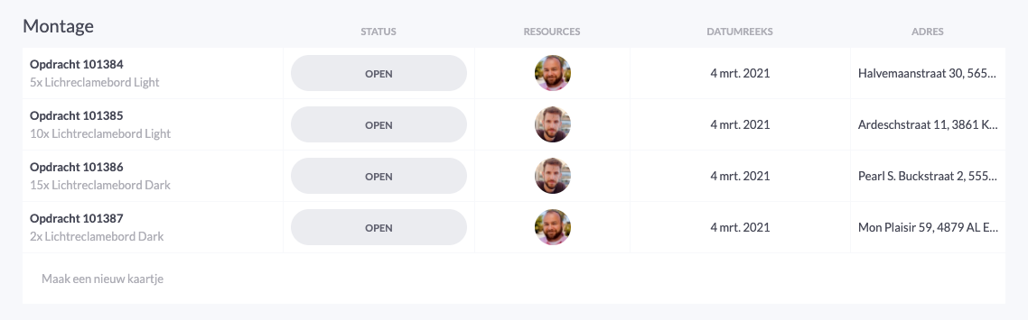
Our favorite color! Purple symbolizes creativity and inspiration, among other things. vPlan stands for inspiration, which is why the purple color has a prominent place in our application, such as our purple icons.
Colors to avoid for productivity
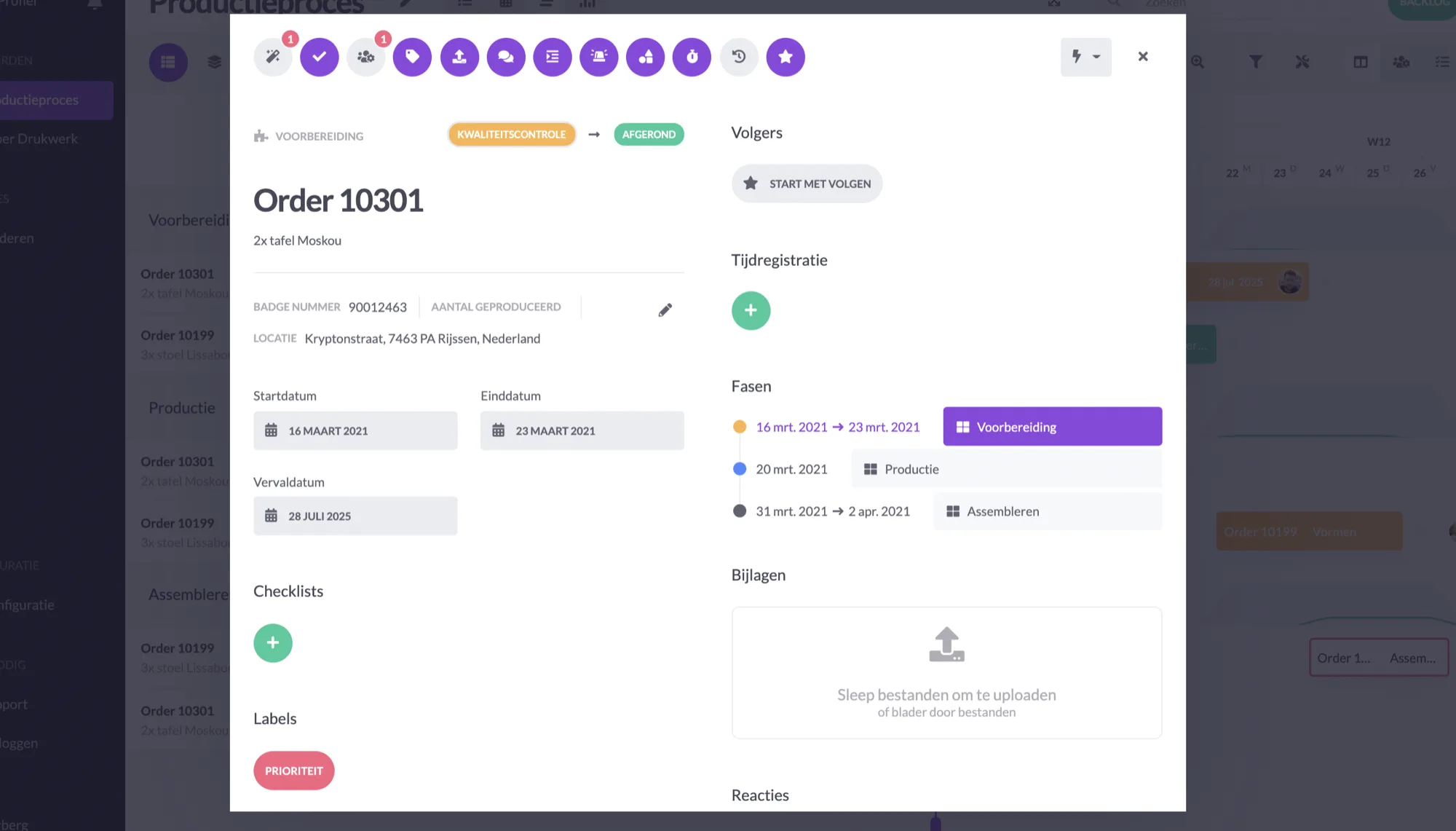
Black - Black evokes little emotion and motivation. It has a depressive effect on employees' thought processes and is therefore detrimental to productivity.
Dark Gray - Dark gray is an unpleasant color for most people to look at. Additionally, dark gray inhibits creativity in all areas.

Work at vPlan
We are looking for new colleagues.